


Algorhythm
- Head of Design
- Front-end engineering
- Marketing materials
Owning 0→1 product launch for an LLM powered music-marketing strategy platform. Clients include Sony AWAL and Warner Music UK.

Defining the Problem
Music marketing teams misallocate 80% of their budget due to poor targeting and unclear performance data. Moreover, building authentic relationships with consumers on social media is harder than ever.
We needed to gather key social media data, curate content for marketing teams, and reduce research time drastically. Goals of the project were as follows:
- Achieve clarity and create a free-feeling creator platform that highlighted the user’s visual content
- Inform the user with digestible quantitative data
Primary Challenge
Algorhythm’s intended users were not tech savvy or experienced with social media use. They were instead music marketers.
Therefore we needed to build an interface that was powerful and maintained a clear user flow.
Establishing a Brand Identity
Our team brainstormed values and adjectives that we wanted to embody in all aspects of our design. This included:
- Modern
- Professional
- Creativity and expression
- Experimental
We used these descriptors as our thesis that would structure our design system henceforth.
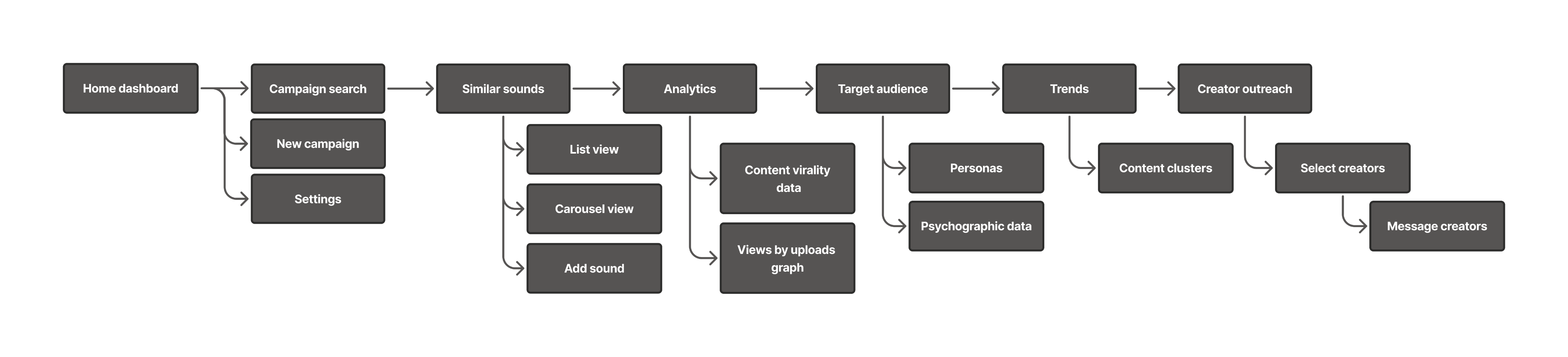
User Flow
Users are taken through the platform emulating that of a real marketing campaign.
Iterations
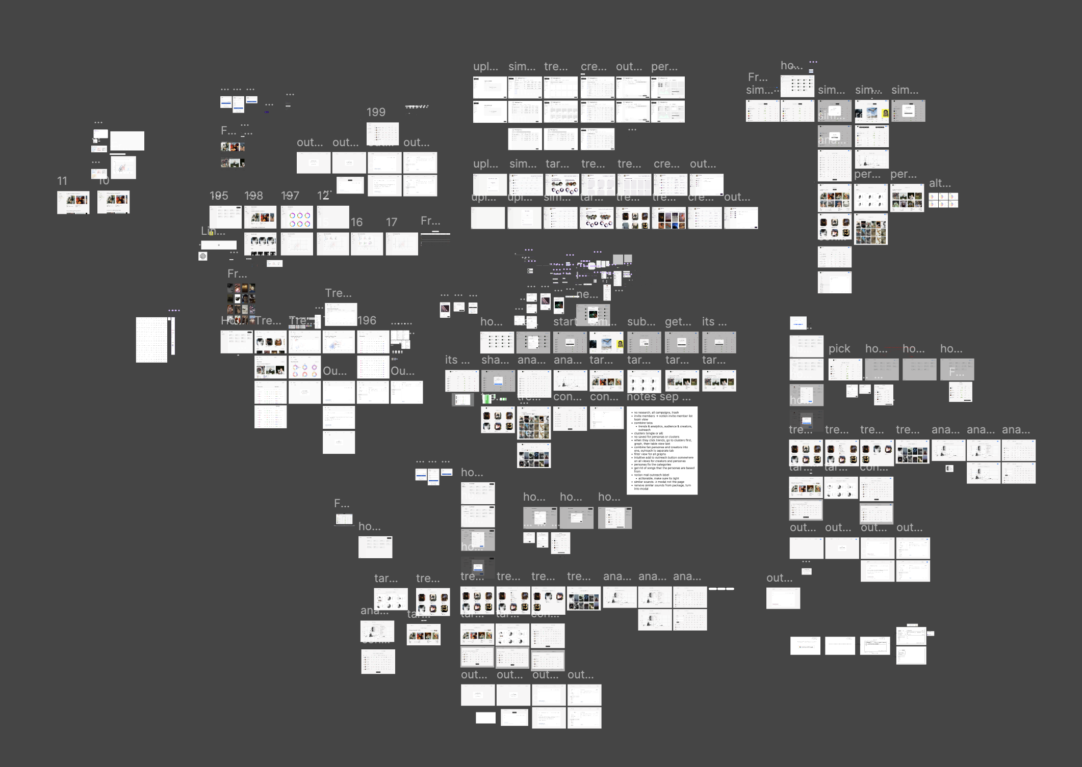
9 rounds of iterations were conducted, each directly in response to complaints from clients. Initial iterations were focused on establishing layout and V0 features. Mid-round iterations integrated brand identity, styling, and additional features requested by stakeholders. Final iterations prioritized tightening user flow and ensuring functionality.
Creating a Component Library
Due to the nature of the product, components ended up being very complex and included a multitude of variations. Components were therefore separated by degrees of variations.

Interfaces
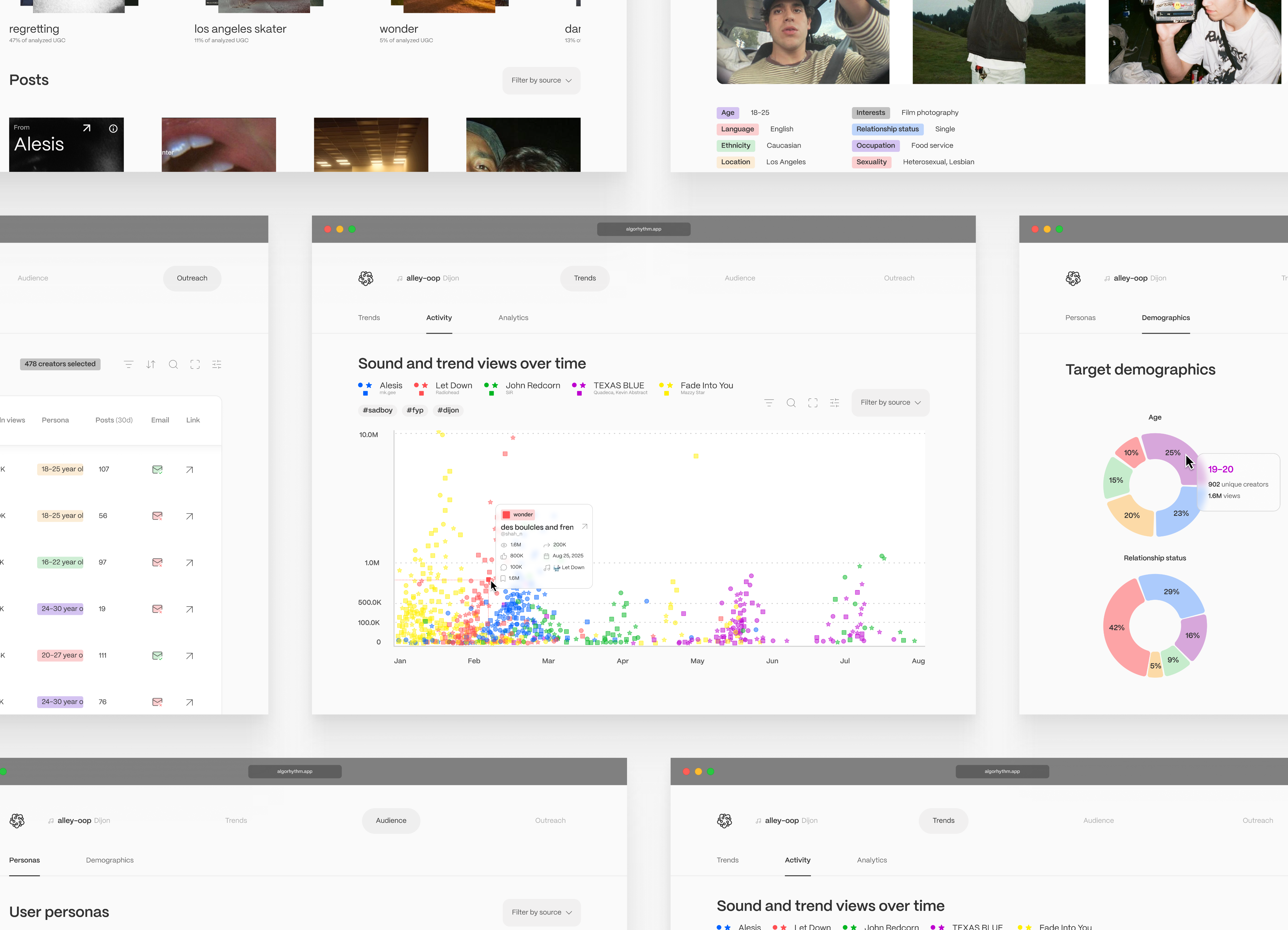
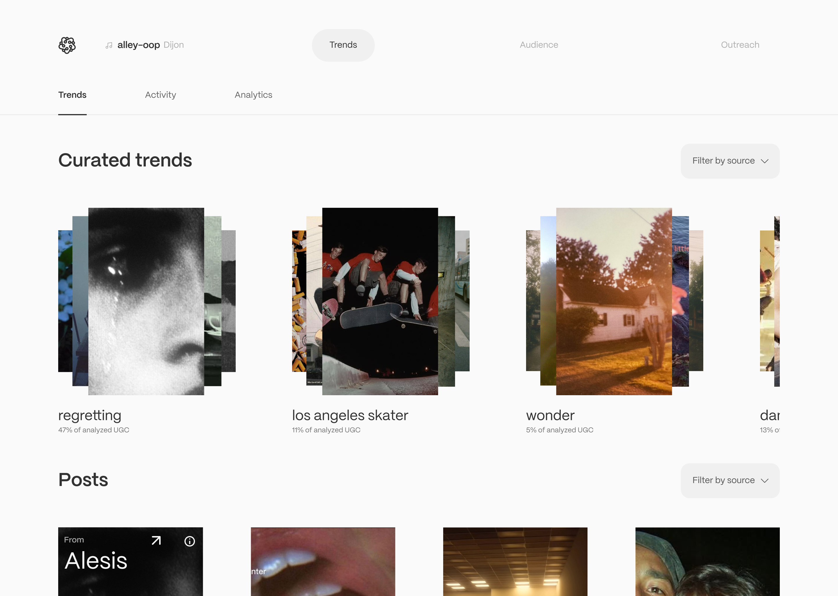
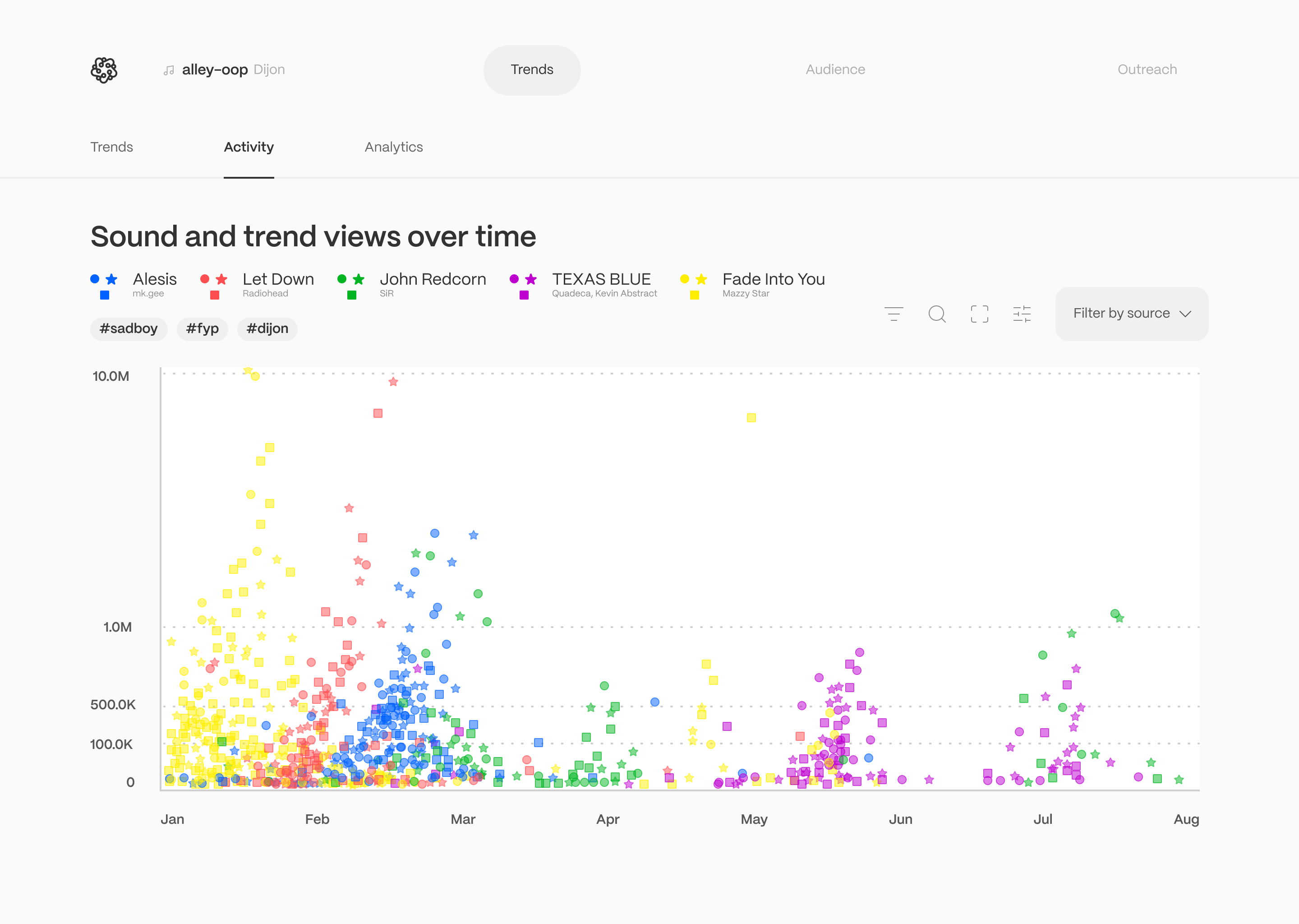
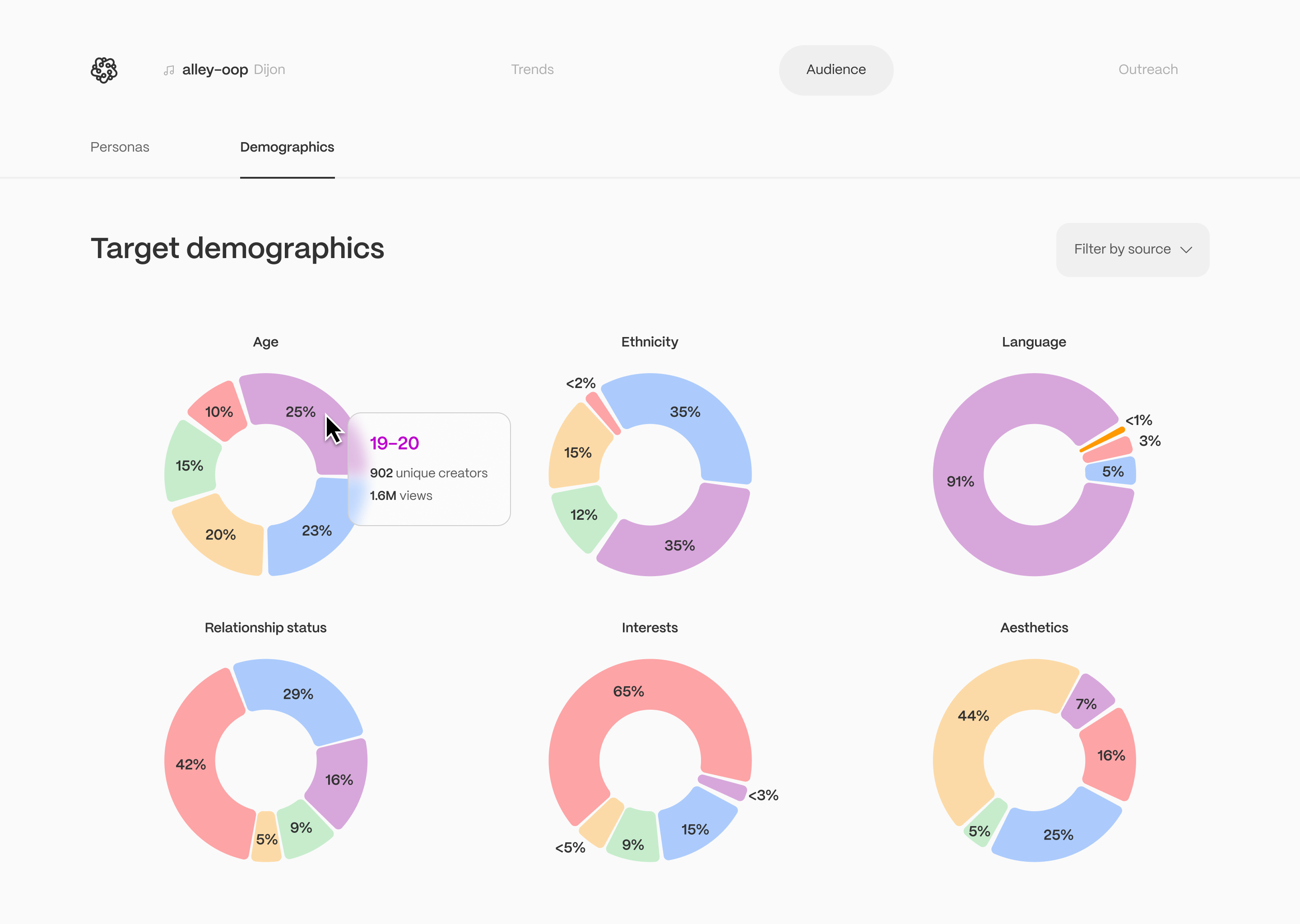
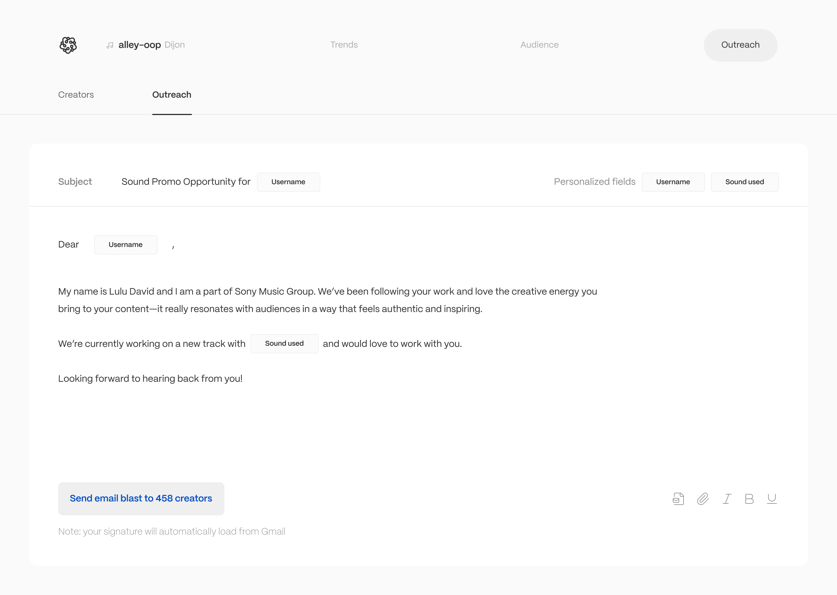
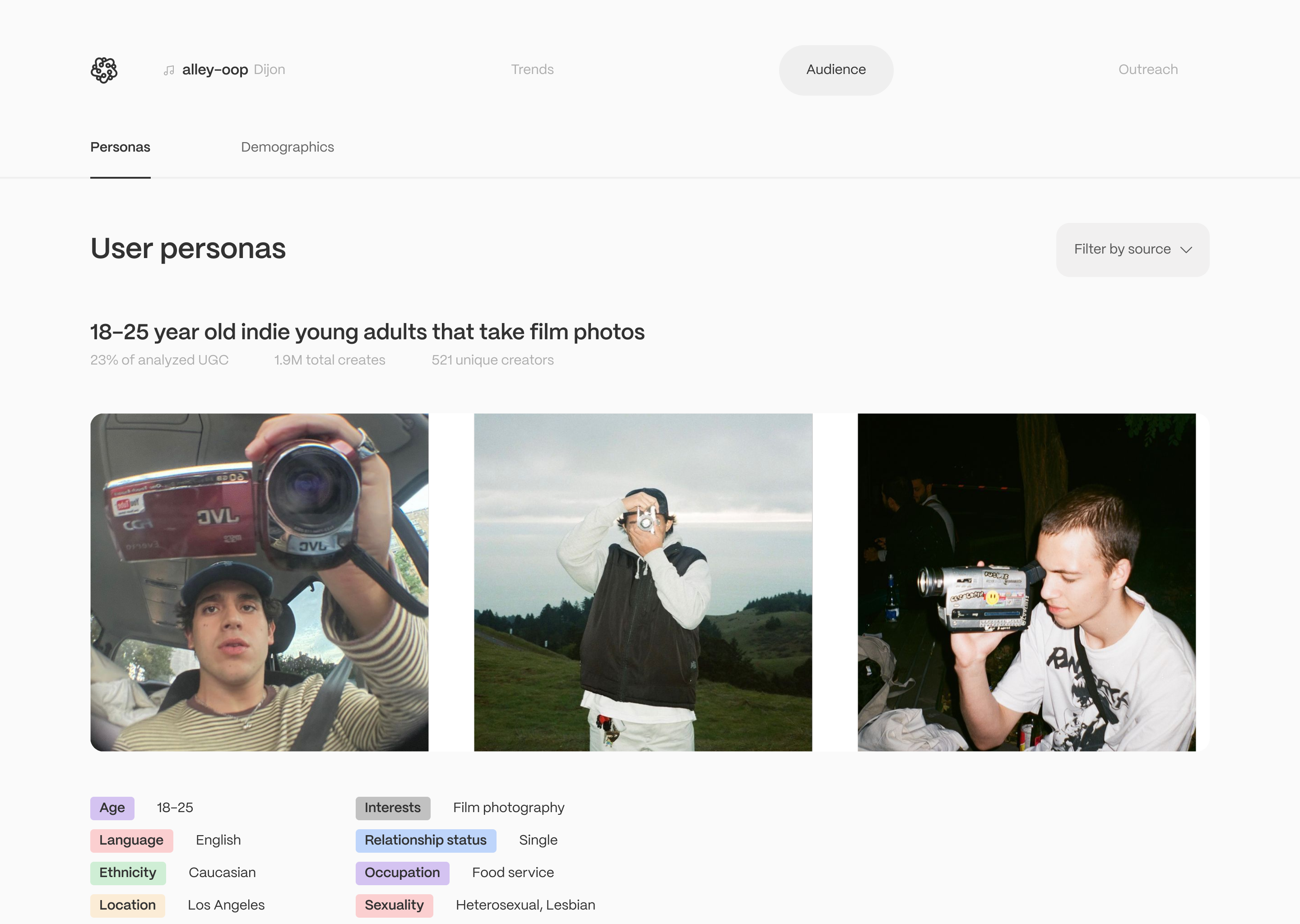
The primary product features are as follows:
- Trend across similar sounds
- Activity across similar sounds
- Analytics
- Audience persona
- Content creator outreach

Custom icons

Testing and Validation
Stakeholder feedback was overwhelmingly positive. The interface and features garnered interest from investors and pushed us into funding round. Top music marketing companies (Sony, Warner Music Group) waged to purchase an exclusive of our product, and eventually, Algorhythm received a $500K offer from Sony AWAL CEO Lonny Olinick.
In initial iterations, users complained about a sense of cognitive overload and a feeling of decision paralysis. Later iterations showed a large increase in understanding of interface and higher click rates (studied through PostHog).
Prototyping
Case Study
This was a huge project. Due to how complex this project was and the amount of iterations I went through, this case study does not represent my full research and logic. For a more in depth discussion of my design decisions, please reach out to me for a call and I’d love to go more in depth!
Email me


Algorhythm
- Head of Design
- Front-end engineering
- Marketing materials
Owning 0→1 product launch for an LLM powered music-marketing strategy platform. Clients include Sony AWAL and Warner Music UK.

Defining the Problem
Music marketing teams misallocate 80% of their budget due to poor targeting and unclear performance data. Moreover, building authentic relationships with consumers on social media is harder than ever.
We needed to gather key social media data, curate content for marketing teams, and reduce research time drastically. Goals of the project were as follows:
- Achieve clarity and create a free-feeling creator platform that highlighted the user’s visual content
- Inform the user with digestible quantitative data
Primary Challenge
Algorhythm’s intended users were not tech savvy or experienced with social media use. They were instead music marketers.
Therefore we needed to build an interface that was powerful and maintained a clear user flow.
Establishing a Brand Identity
Our team brainstormed values and adjectives that we wanted to embody in all aspects of our design. This included:
- Modern
- Professional
- Creativity and expression
- Experimental
We used these descriptors as our thesis that would structure our design system henceforth.
User Flow
Users are taken through the platform emulating that of a real marketing campaign.
Iterations
9 rounds of iterations were conducted, each directly in response to complaints from clients. Initial iterations were focused on establishing layout and V0 features. Mid-round iterations integrated brand identity, styling, and additional features requested by stakeholders. Final iterations prioritized tightening user flow and ensuring functionality.
Creating a Component Library
Due to the nature of the product, components ended up being very complex and included a multitude of variations. Components were therefore separated by degrees of variations.
Interfaces
The primary product features are as follows:
- Trend across similar sounds
- Activity across similar sounds
- Analytics
- Audience persona
- Content creator outreach

Custom icons
Testing and Validation
Stakeholder feedback was overwhelmingly positive. The interface and features garnered interest from investors and pushed us into funding round. Top music marketing companies (Sony, Warner Music Group) waged to purchase an exclusive of our product, and eventually, Algorhythm received a $500K offer from Sony AWAL CEO Lonny Olinick.
In initial iterations, users complained about a sense of cognitive overload and a feeling of decision paralysis. Later iterations showed a large increase in understanding of interface and higher click rates (studied through PostHog).
Prototyping
Case Study
This was a huge project. Due to how complex this project was and the amount of iterations I went through, this case study does not represent my full research and logic. For a more in depth discussion of my design decisions, please reach out to me for a call and I’d love to go more in depth!
Email me